The Process
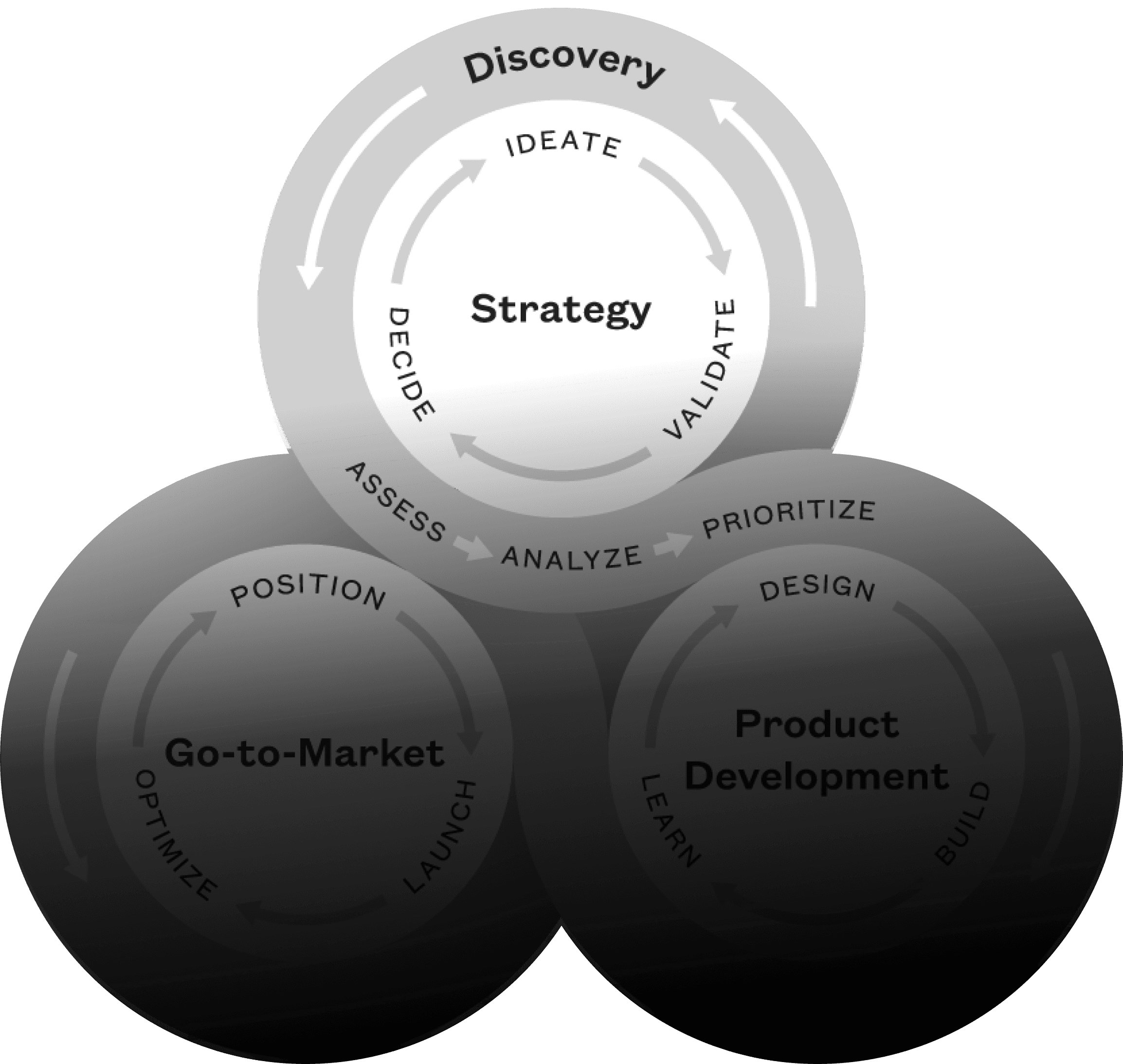
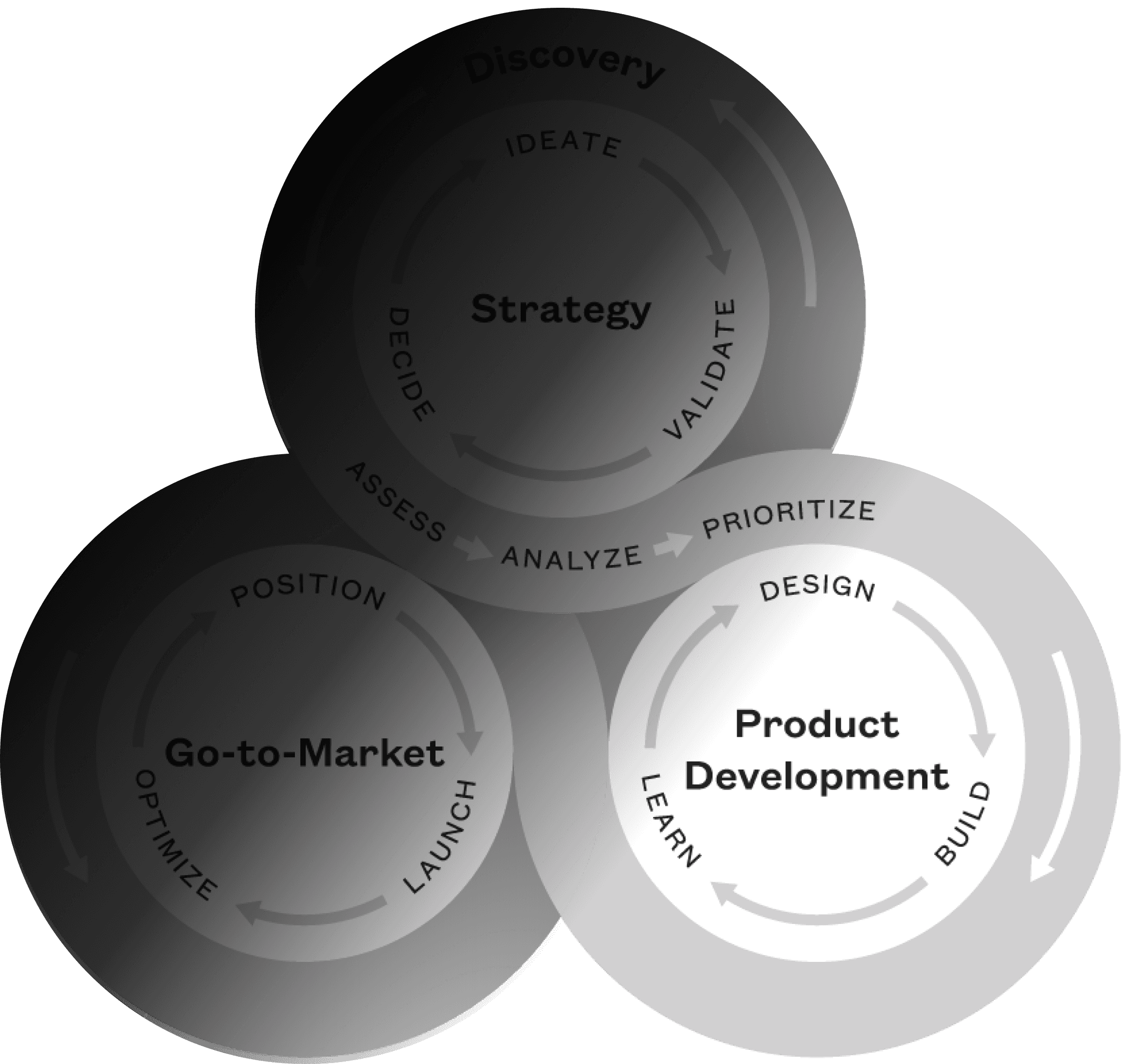
Discovery
Initial Analysis and Requirement Gathering:
The project commenced with a detailed UX audit to pinpoint opportunities for enhancing conversion rates. This phase involved a thorough examination of the client's current website, understanding the underlying challenges, and analyzing requirements.
UX Audit Insights
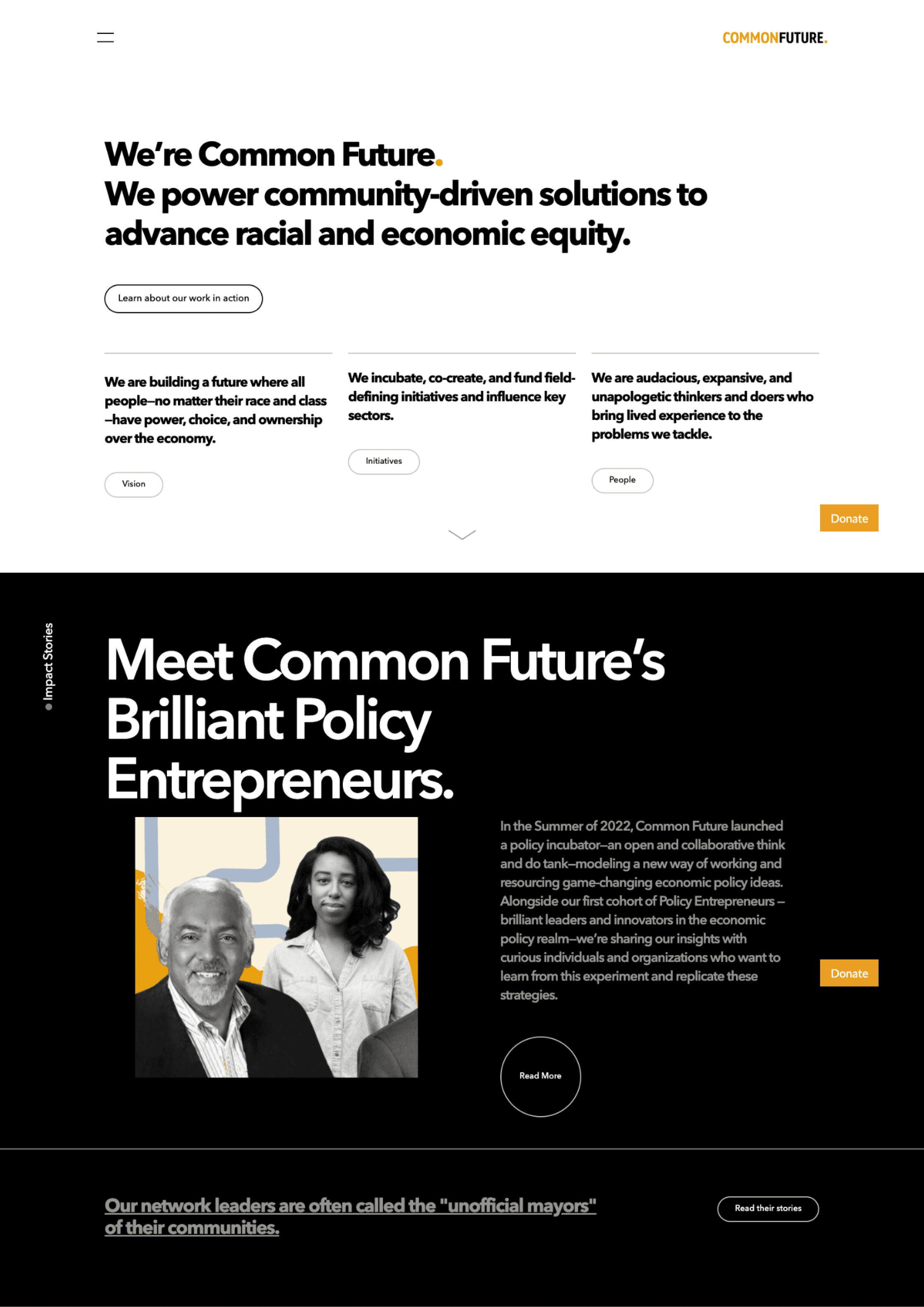
• Navigation Clarity and Accessibility: The site features a straightforward navigation bar, but it could benefit from more explicit labeling and a sticky navigation feature for easier access as users scroll.
• Content Hierarchy and Readability: The site presents its mission and initiatives clearly. However, improvements in typography, such as font size and paragraph spacing, could enhance readability, especially for longer sections.
• Visual Design and Consistency: The website employs a minimalist aesthetic that aligns with its brand. Yet, the consistency of visual elements (e.g., button styles, iconography) could be optimized across pages to reinforce brand identity.
• Mobile Responsiveness: While not detailed in my overview, the website's performance on mobile devices is critical. Ensuring responsive design for varied screen sizes and devices is essential for accessibility and user engagement.
• Interactive Elements and Engagement: The addition of interactive elements, such as hover effects on links or dynamic statistics about the organization's impact, could increase user engagement.
• Loading Speed and Optimization: The website's loading time impacts user experience significantly. Optimizing images and leveraging browser caching are potential areas for improvement.
• SEO and Content Strategy: While the site's content is informative, a more robust SEO strategy could enhance its visibility. This includes meta tags, alt text for images, and keyword optimization.
• User Feedback and Contact Opportunities: Lastly, offering more prominent and varied opportunities for users to engage or provide feedback could foster a community around the organization's mission.
Research and Documentation:
Following the initial analysis, extensive research was conducted focusing on competitor analysis, understanding the target audience, and clarifying the project's objectives. This research served as a foundation for all subsequent decisions and was meticulously documented for reference.
Target Segments
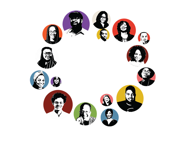
Common Future’s target segments are different groups of people who are all part of the same ecosystem. They are segmented into three groups: institutions that hold capital and power, institutions that build capital and power, and individuals that are interested in CommonFuture’s work.
Institutions that hold capital and power and institutions that build capital and power are primary segments. These two segments most often engage with Common Future. They directly invest in Common Future's growth and create an impact through field-defining initiatives. In addition, their engagement and synergy with Common Future advance the organizational mission to close the racial wealth gap and power community-driven solutions to advance racial and economic equity.Each target segment differs in terms of their psychological traits, expectations, and needs, but they have the same goal: to shift power in the economy and build a future where all people—no matter their race and class—have power, choice, and ownership over the economy.
Solutions
The proposed solution to address Common Future's problem is to improve their website, storytelling, and community engagement, by creating a more holistic digital experience.
This will involve creating a unified and centralized information architecture, developing a robust content management system and page build system, optimizing the website for technical performance and search indexing, and integrating the website with Common Future's tech stack and marketing analytics tools.
Competitor Analysis
My research included competitive analysis to better understand the UX of non-profit sectors , and the insights into the landscape of the social impact industry and Common Future's position in relation to other industry players.
Geographical Coverage
Common Future
Ashoka
Justice Funders
Frontline Solution
Years on the Market
Portfolio of Services
Social Media Presence
Web Experience
Geographic Coverage
world expansion
region
country
country
Years on the Market
30+
20-30
10-20
up to 10
Social Media Presence
more 100,000
30,00-100,00
30,000-10,000
less than 10,000
Website Interface
positioning
usability
design
creativity
Strategy
Strategy & Planning
With clear objectives, target audience, and key functionalities outlined, the next step involved strategizing the optimal solutions and technologies to address the identified challenges. Deliverables during this phase included site maps, technology inspirations, user personas, and the information architecture. These deliverables were regularly reviewed and refined in collaboration with the team and client to ensure alignment with project goals.
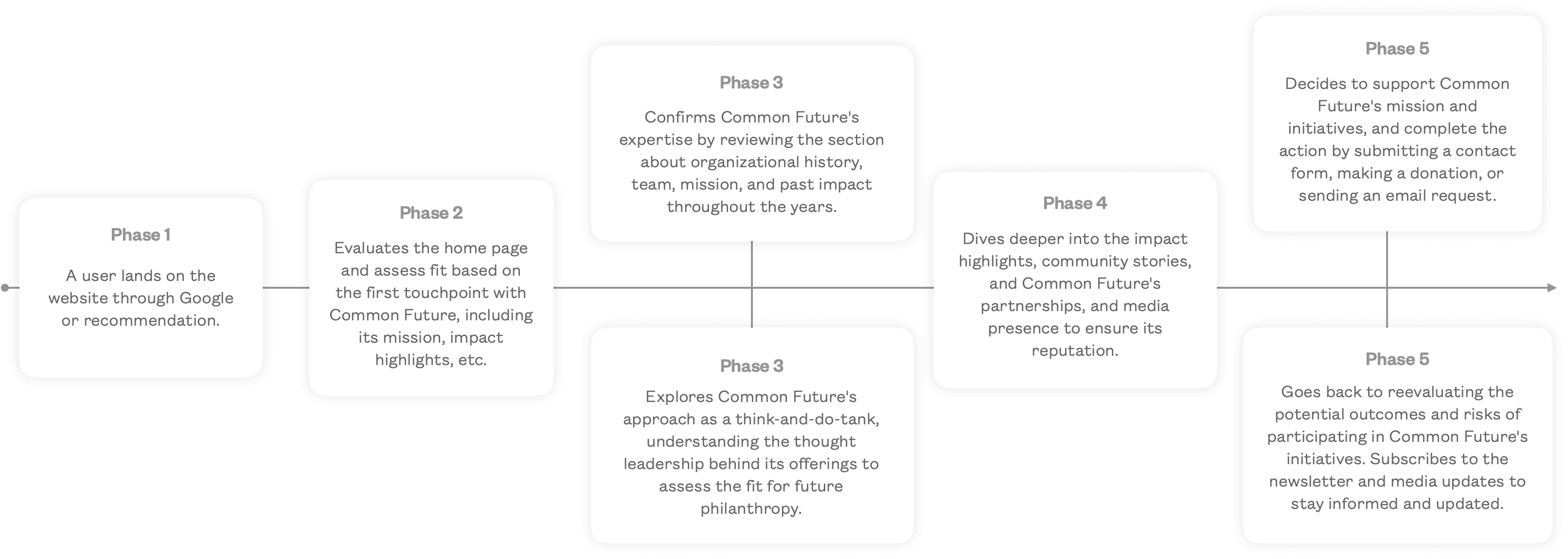
User Flow
The user flow was create using Whimsical to illustrate how users will navigate through the website.
Information Architecture
The information architecture for Common Future was designed to align with their growth and strategic plans. This solid base allows for easy expansion and equips the team with the necessary tools for ongoing development of their digital strategies.
Creative Concept
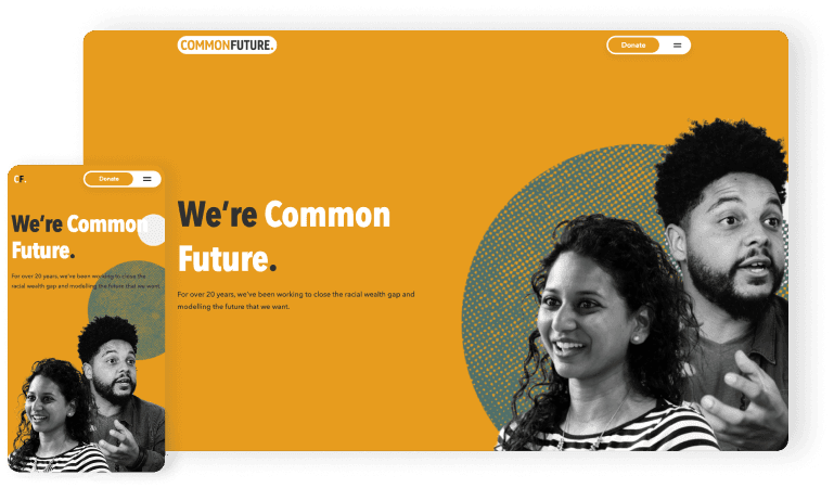
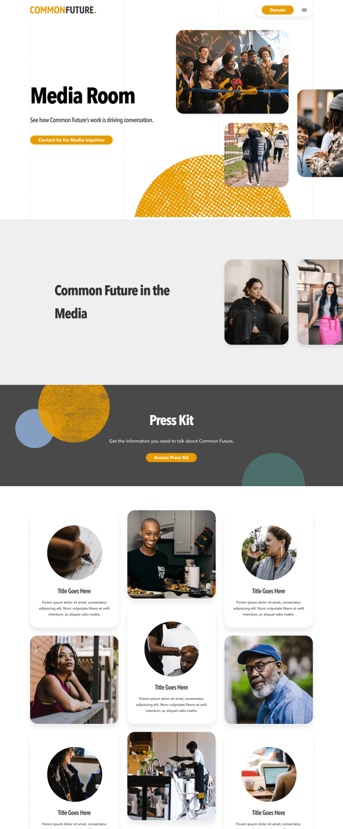
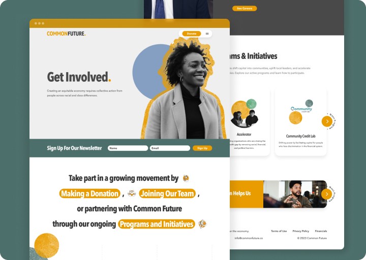
The creative concept for Common Future is centered around amplifying the brand's existing visual identity to highlight the change that the organization is driving in the economy. The concept utilizes dynamic graphic elements to bring the brand to life and showcase its impact.The design aesthetic of the concept is friendly yet trustworthy, with a focus on professional layouts that allow users to explore Common Future's offerings and impacts. The brand's graphic elements are used in various applications to create a cohesive and recognizable look and feel.The ultimate goal of the concept is to position Common Future as a thought leader in the industry and to drive a shift in power in the economy. By highlighting the organization's reputation and impact, the concept aims to inspire action and change among its audience.
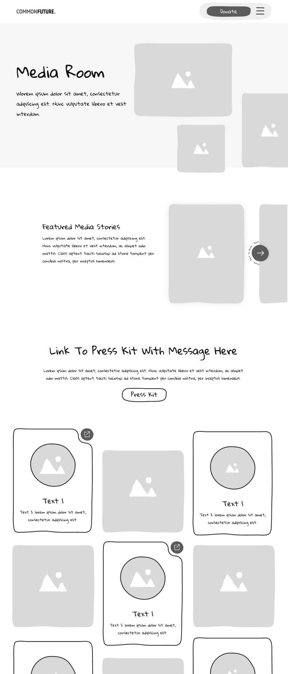
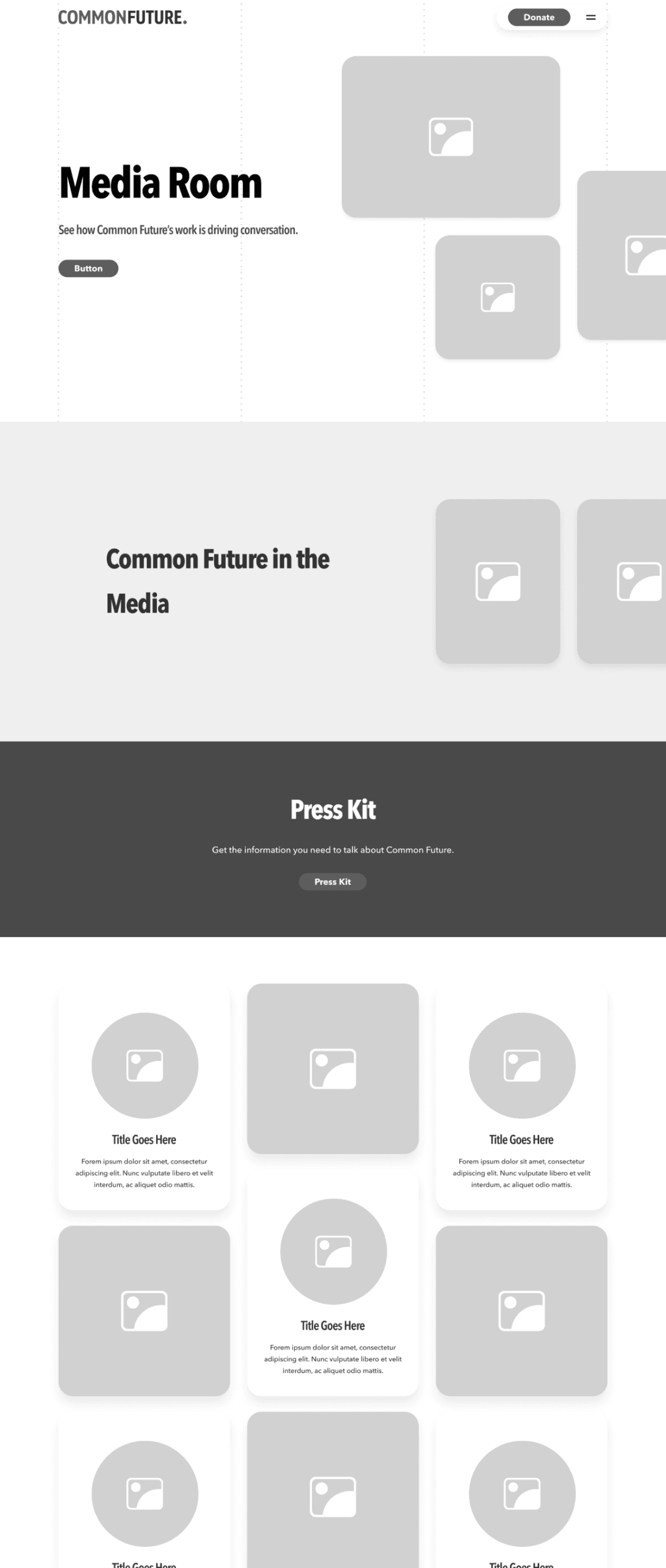
Wireframes
The design of wireframes and prototypes was skillfully handled using Figma, which provided a versatile platform for both design and interactive prototyping.
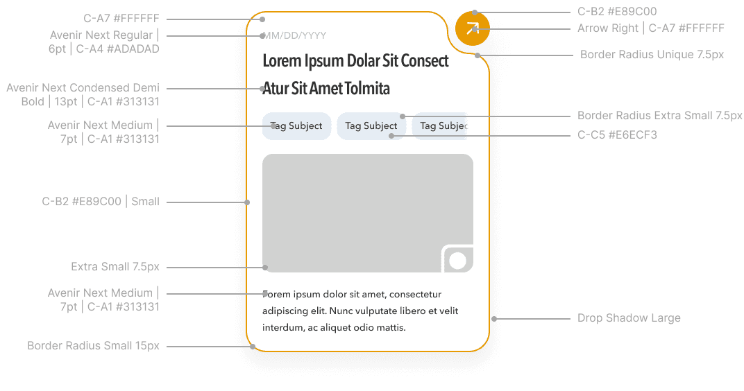
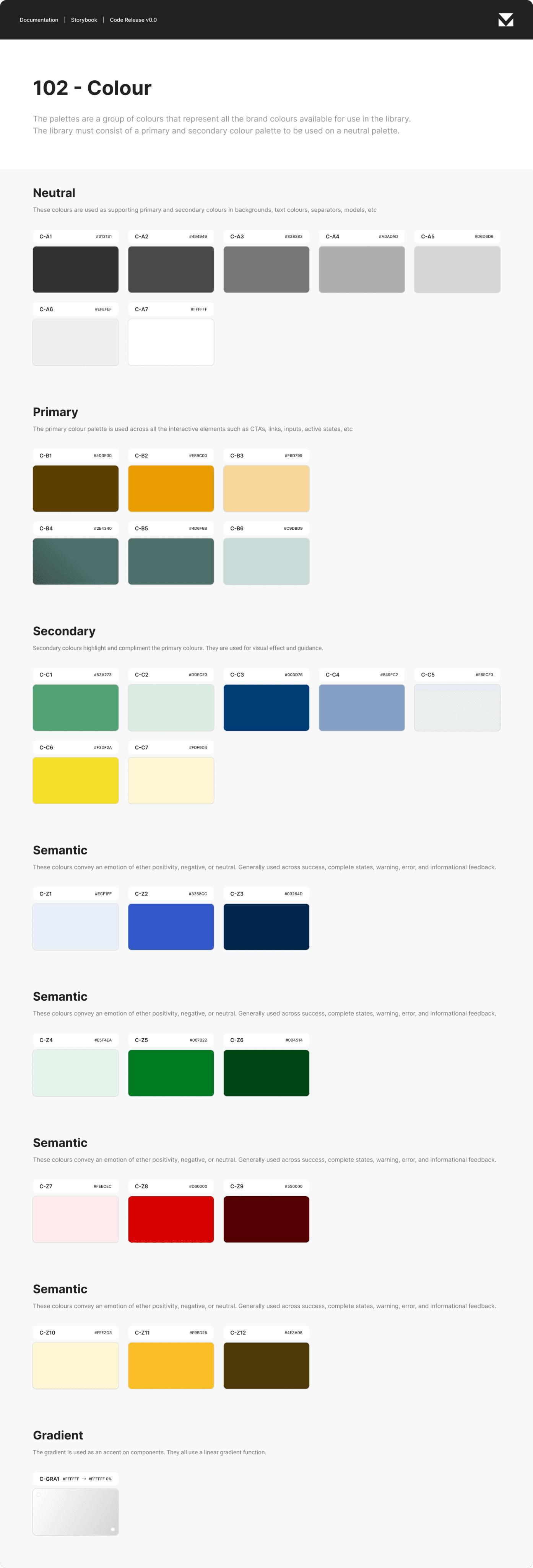
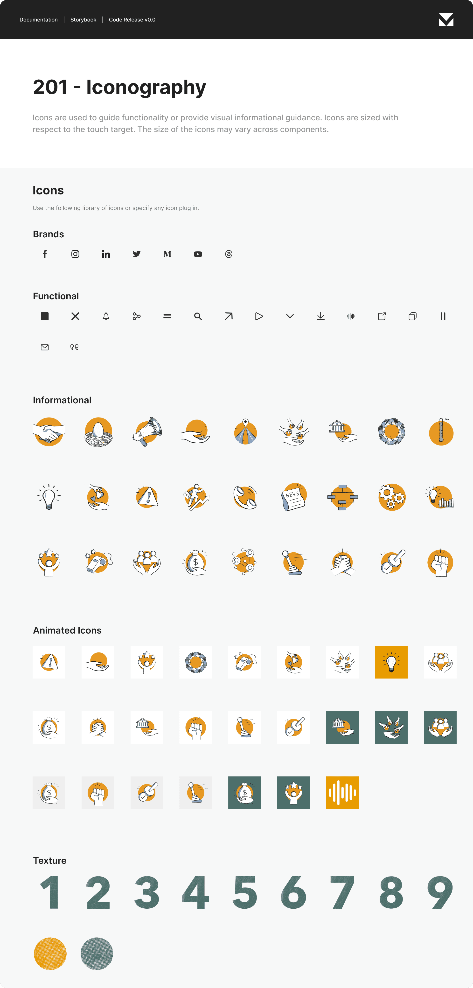
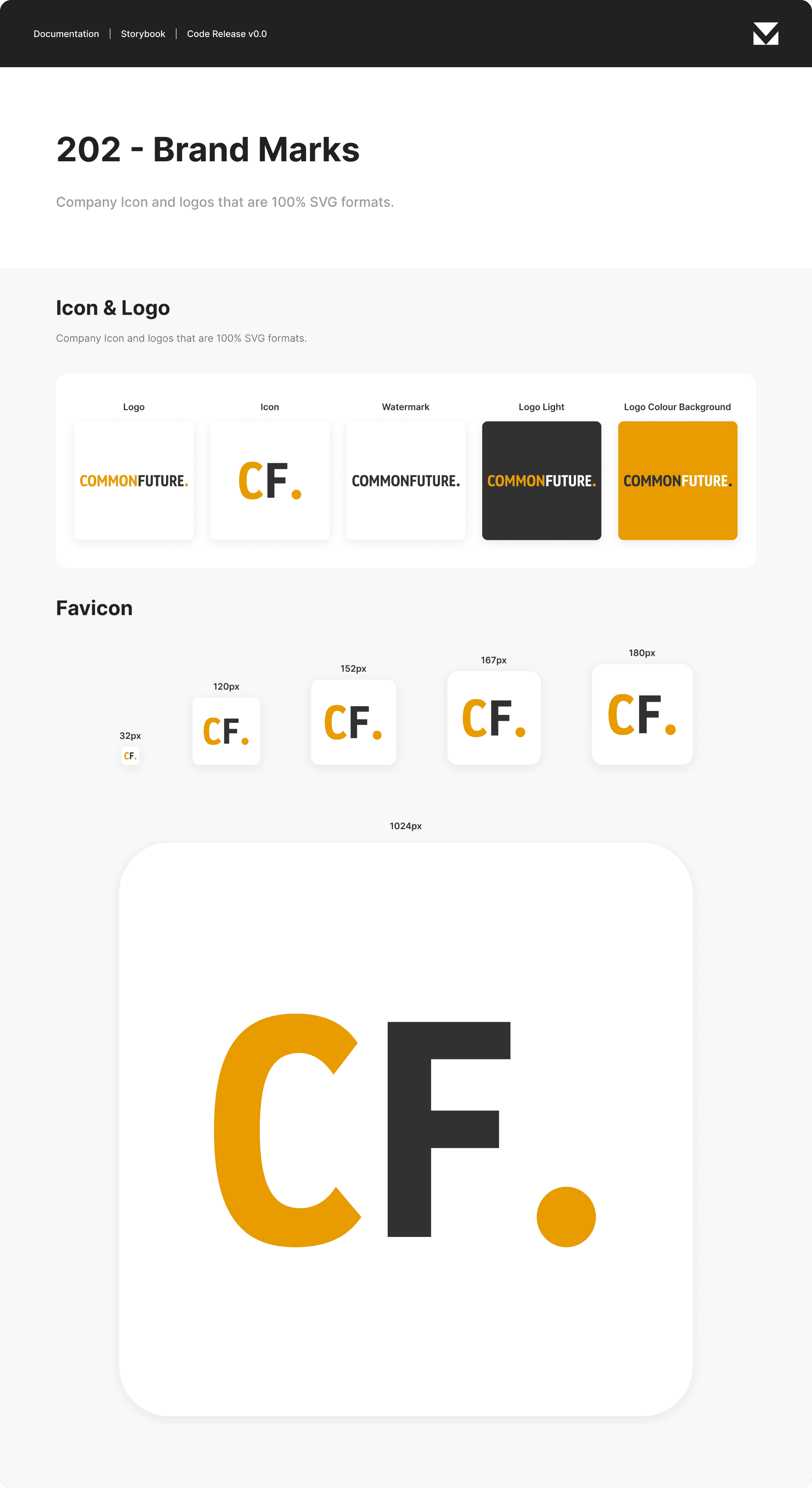
Design Systems

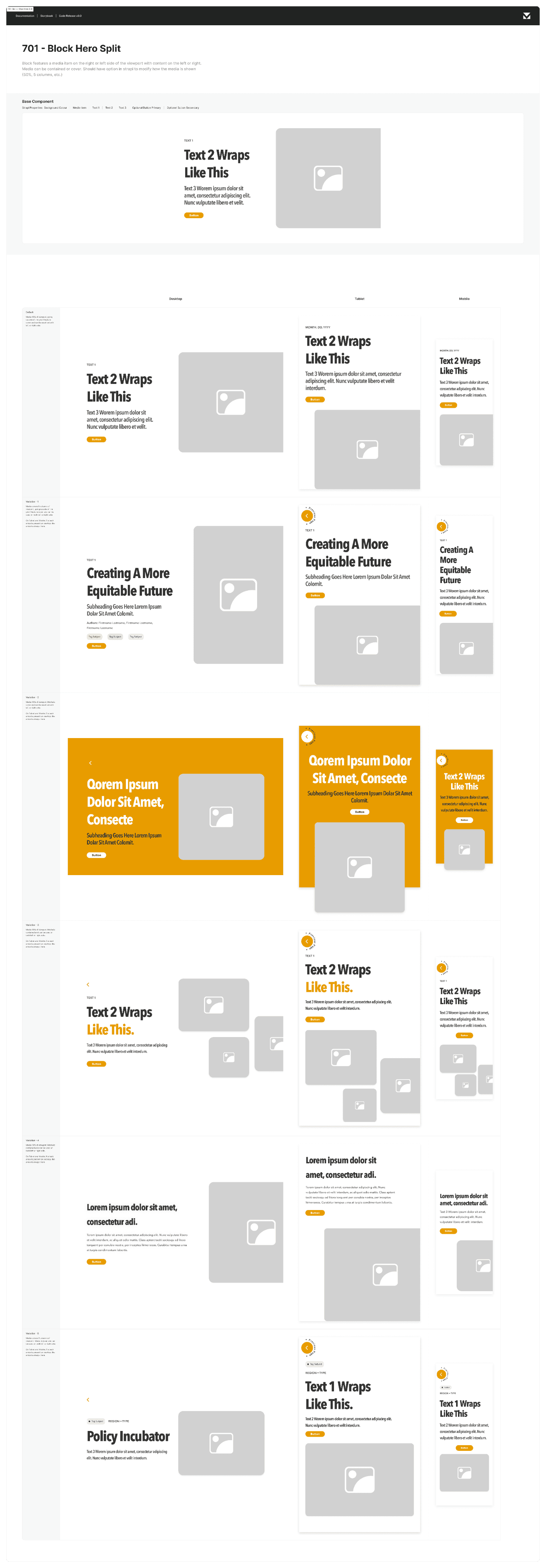


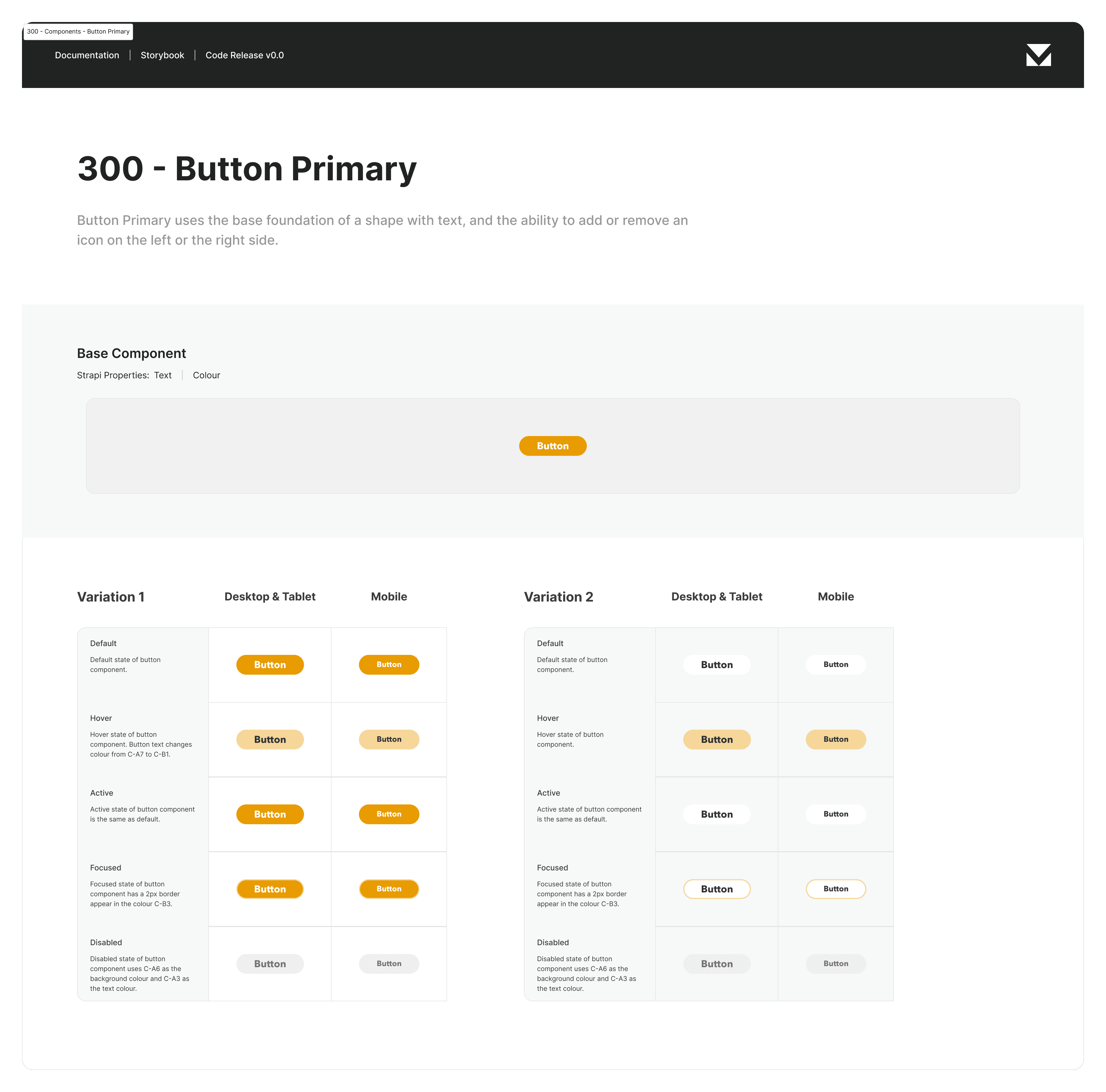
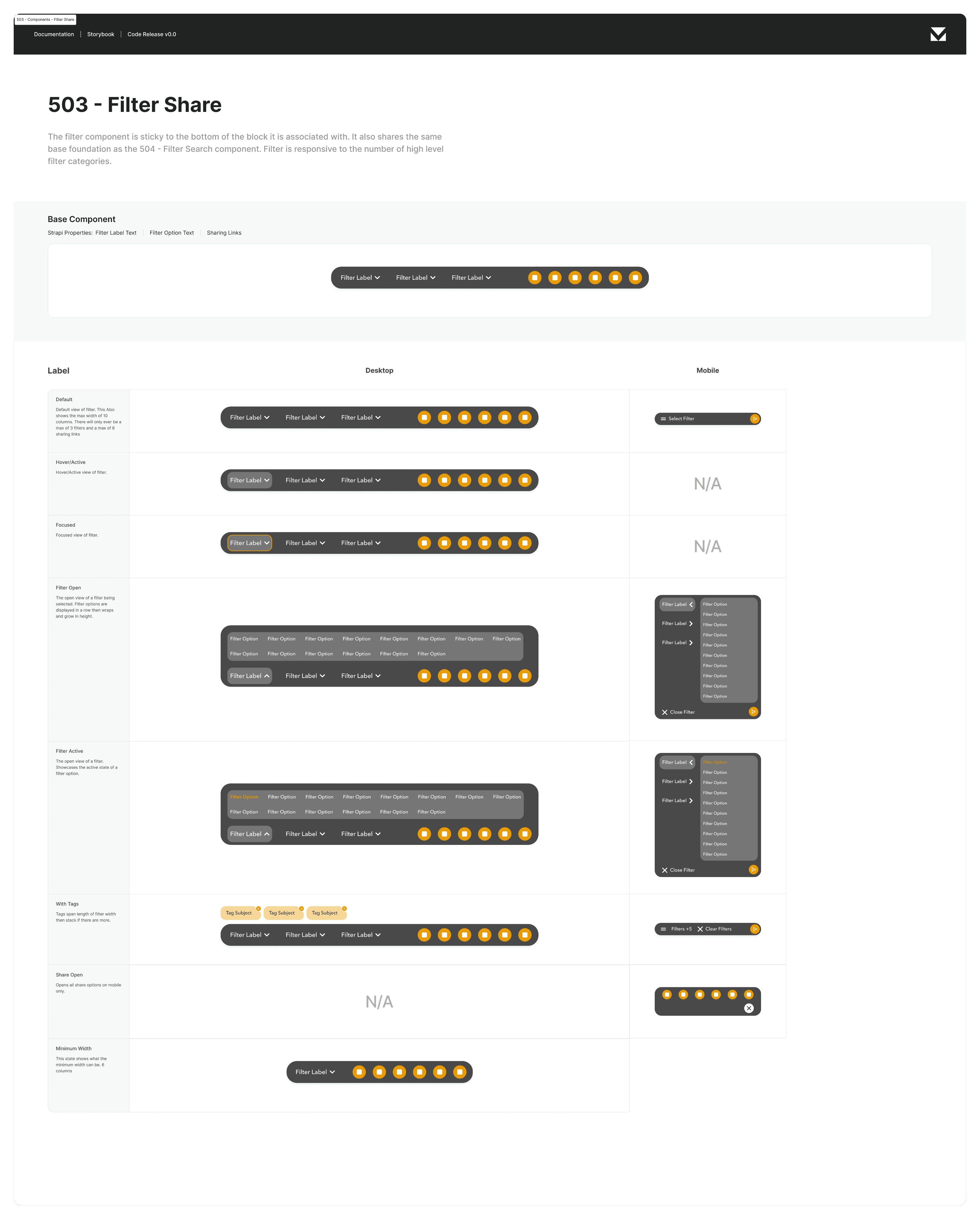
Card Image | Focused State
Results
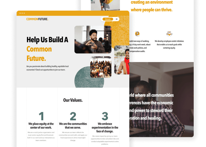
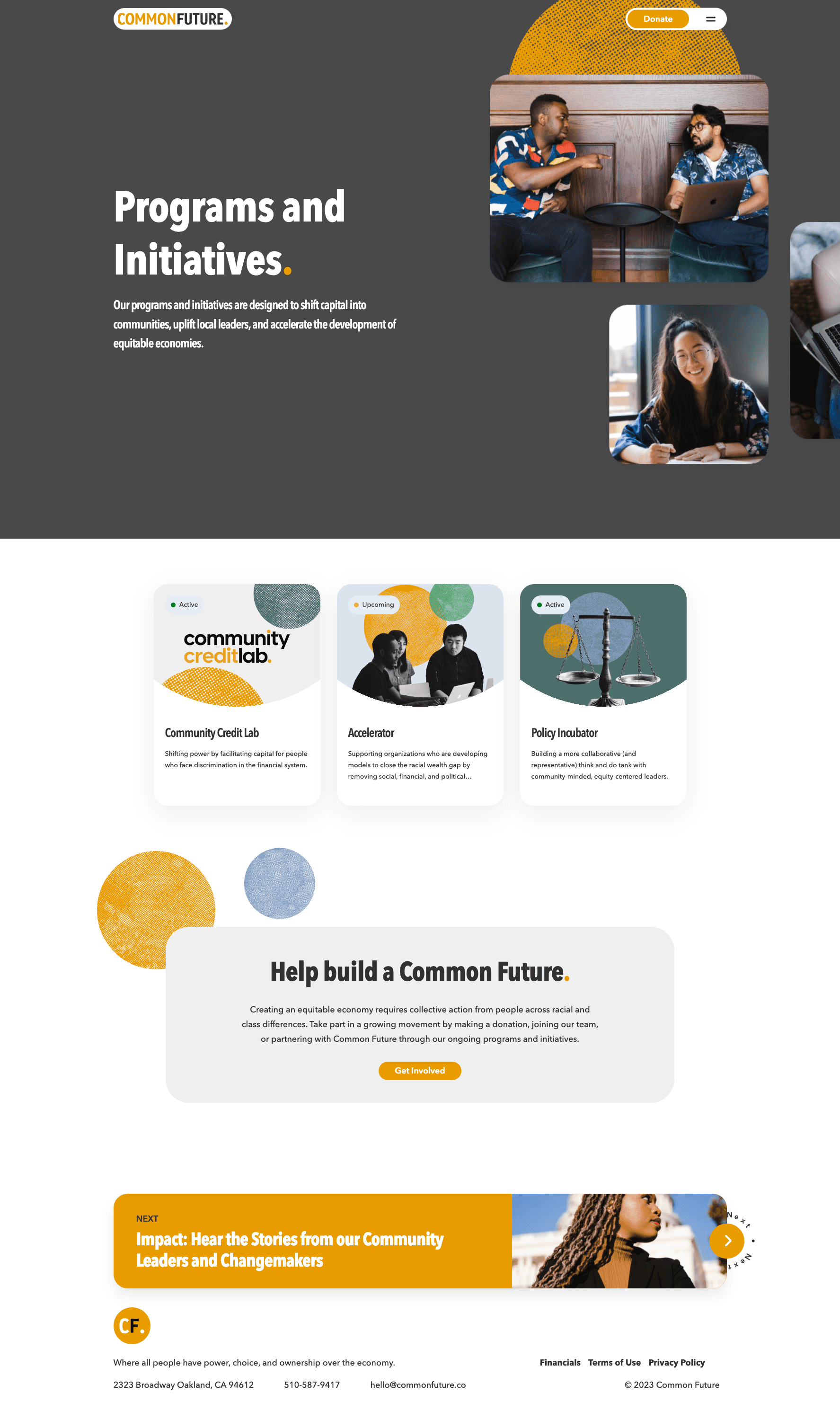
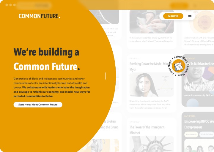
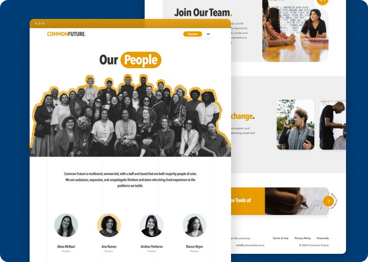
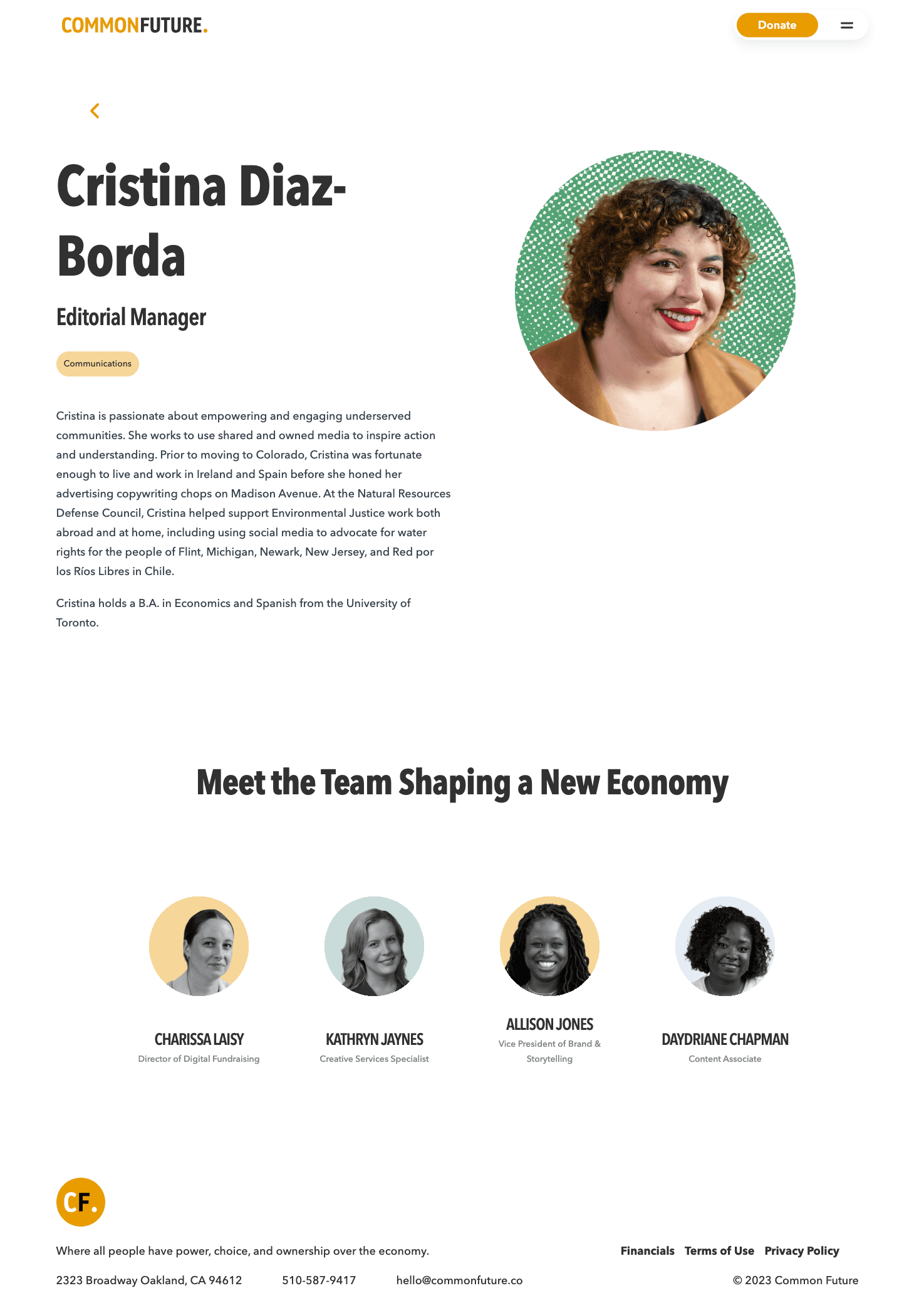
The new website became a robust hub for its diverse stakeholders. The homepage effectively communicates Common Future’s mission of building equitable economies and provides easy access to information about their programs and initiatives. The visuals and colours were used to reflect the organization's community-focused ethos. Overall, the goal was to create an inviting digital space that underscores their commitment to collaboration and systemic change.
